Roebic
Brand Strategy, Brand Identity, Package Design
Before
Program strategy provided solid position in major retailers
Situation
Client with category-leading consumer and industrial buyers wanted to increase retail shelf space.
Outdated packaging displayed small brand logo, focused heavily on individual products but failed to communicate key product benefits and advantages.
Solution
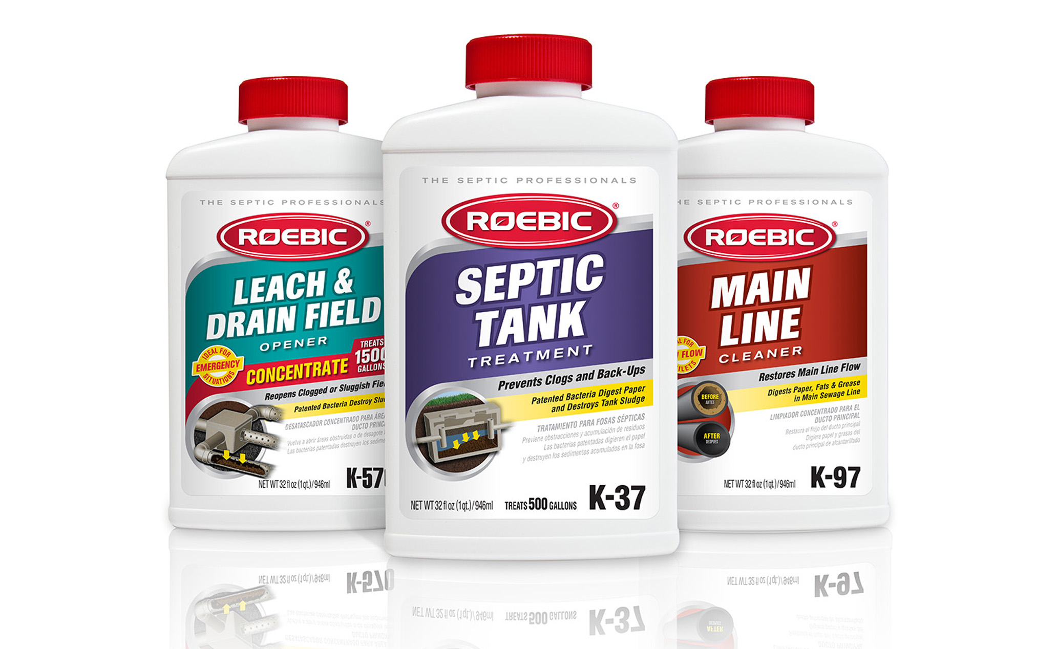
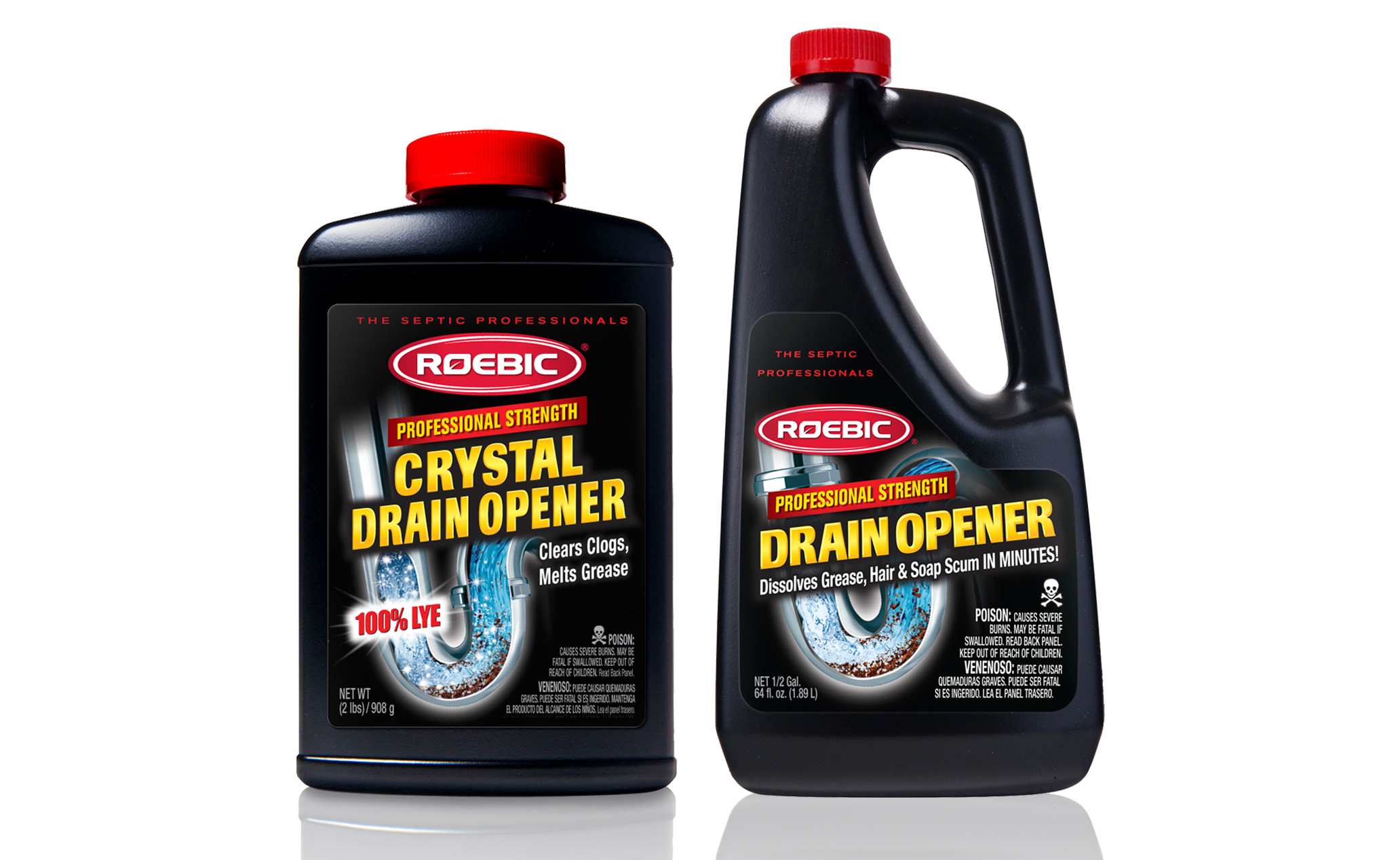
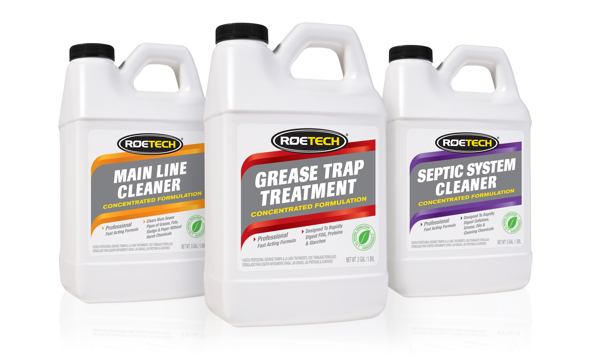
LW analysis recommended division of product line into commercial and consumer categories, plus updated packaging and stronger branding
Prominently displayed brand name and placed it closer to generic name for stronger, memorable branding
Developed modern friendly “doc” character to replace outdated stern-
looking illustration that aged brand


