Henry
Before
Steadily gaining market share and distribution since program relaunch
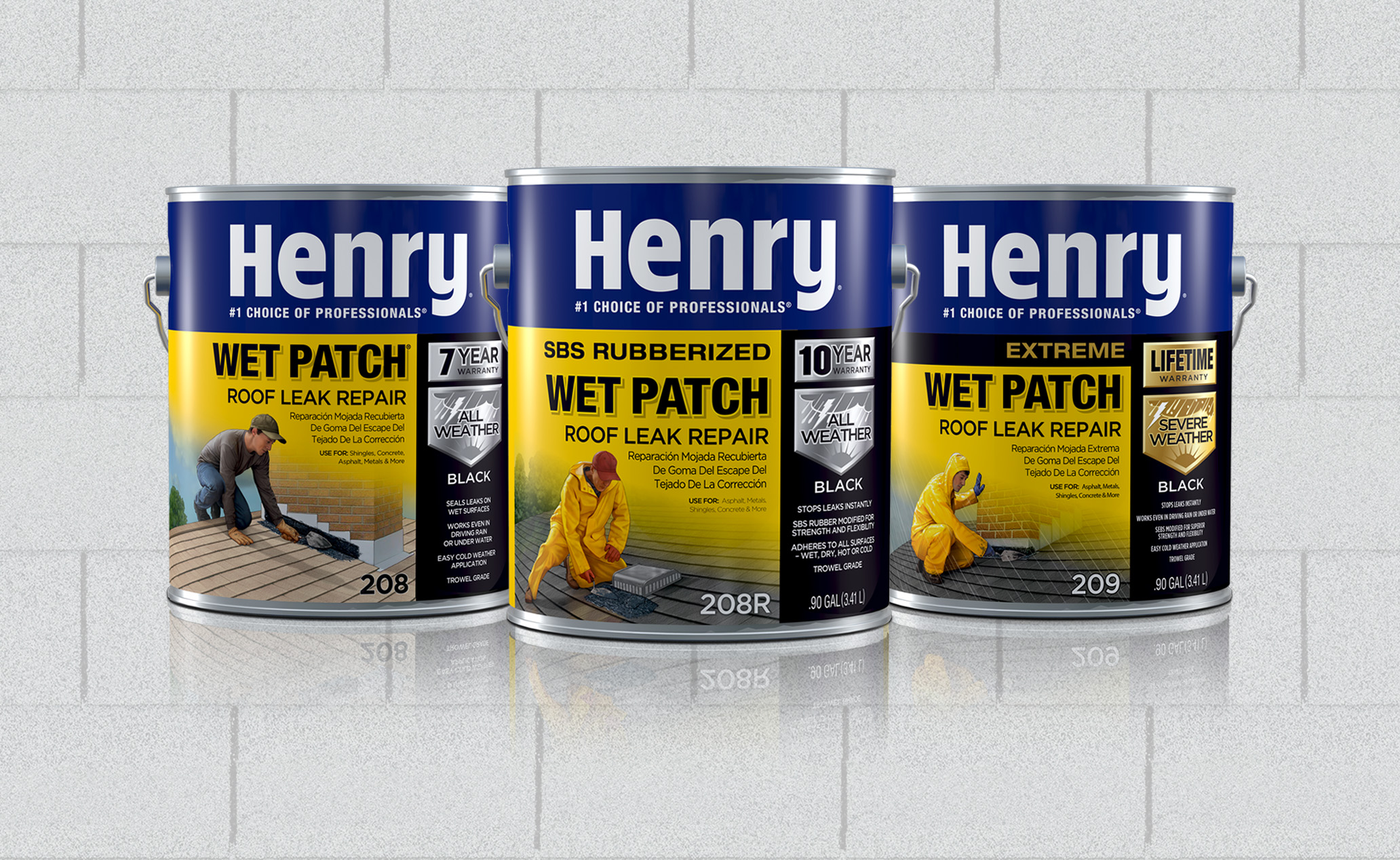
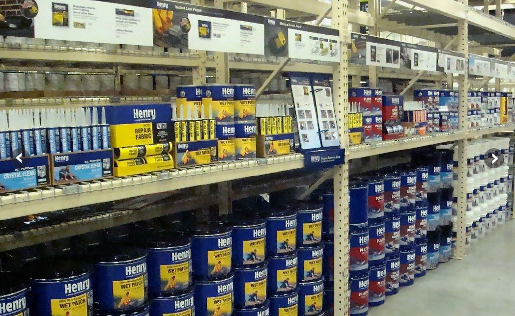
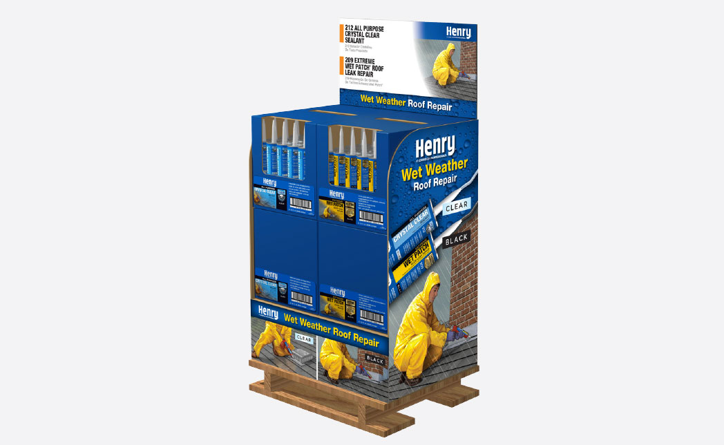
Category leader, with 4 bays in The Home Depot, determined that unicolor “sea of blue” packaging and weak messaging made shopping difficult, resulting in DIY confusion.
LW recommended brand architecture that segmented product line into clearly defined families for best communications for consumer.
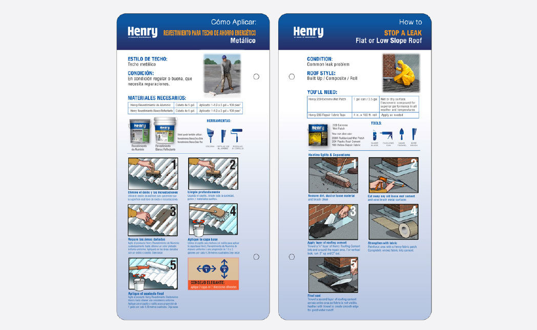
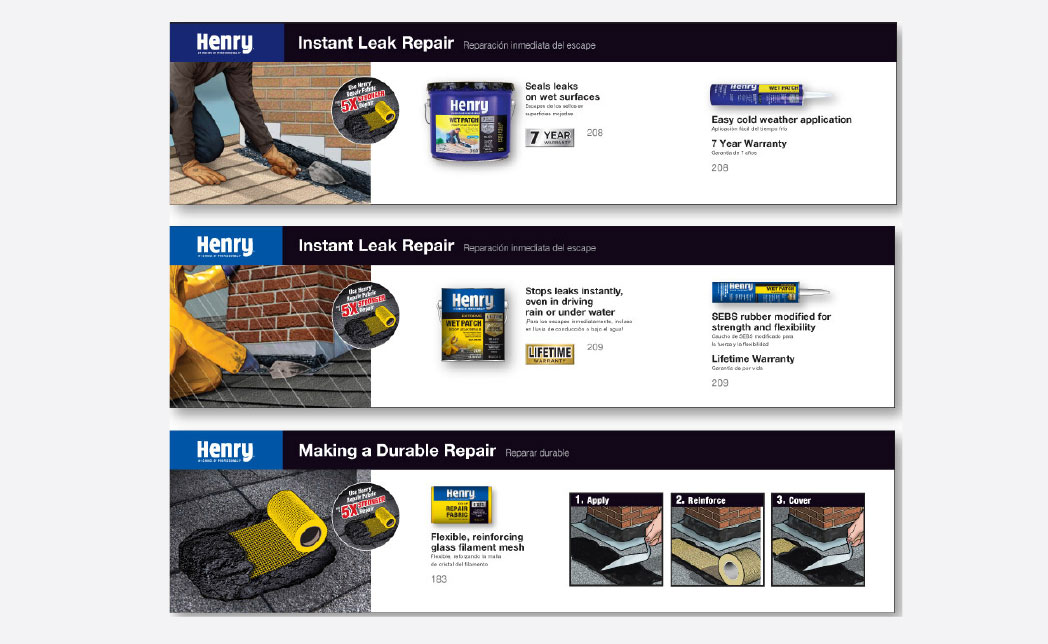
Packaging and merchandising included illustrations of product applications and color palettes to stop, draw in, and further assist DIY shoppers.
Henry Reflective Coatings
Before
Endcap sales exceed expectations and achieved highest end cap dollar volume in Sunbelt stores
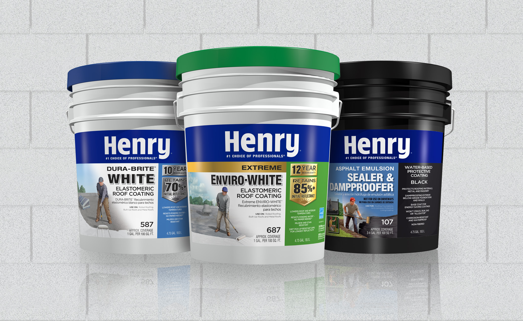
Client identified opportunity to aggressively expand sales of energy-saving white roof coatings in Sunbelt regions.
Client wanted package design and end cap to educate consumers of the many reasons to buy.
LW developed new package design that spoke directly to consumer about valuable money-saving benefits.
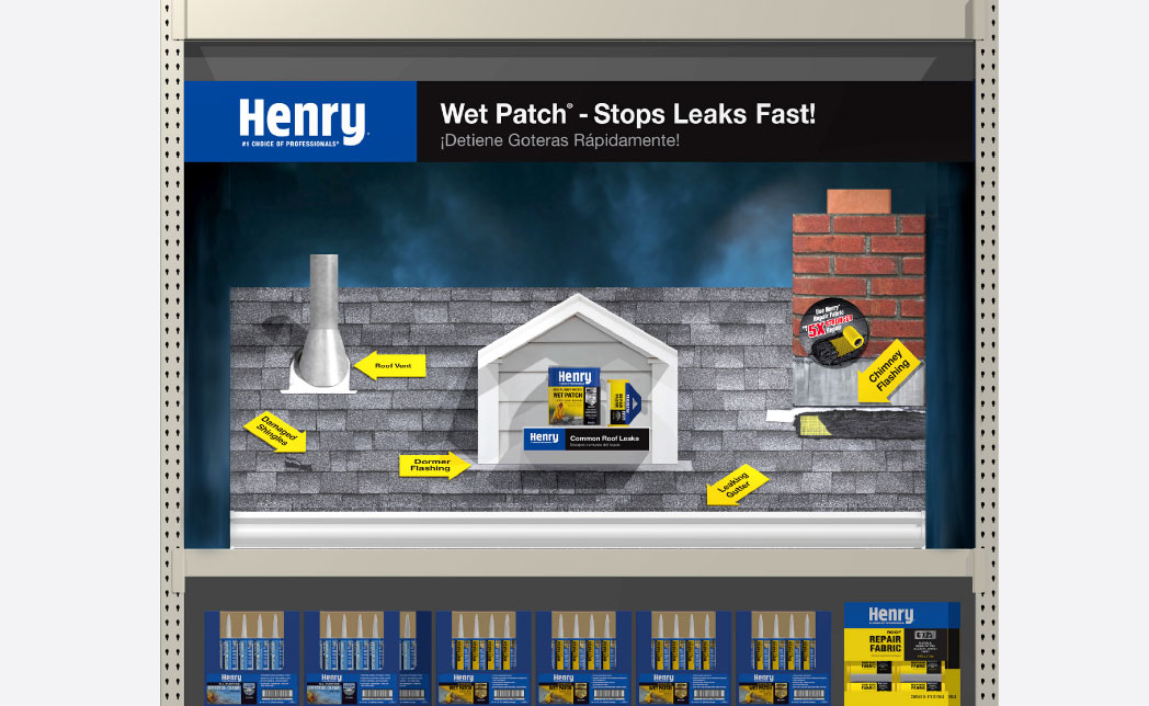
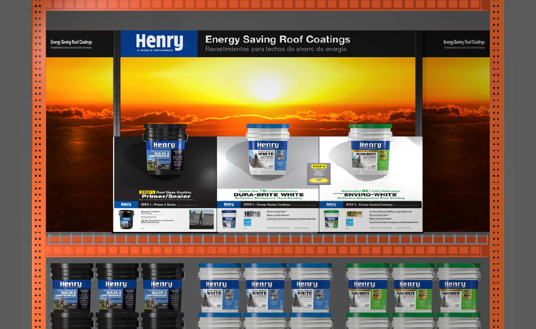
Dramatic end cap stopped and intrigued consumers with panoramic scene, educational messages, and product samples.
End cap displayed three key products, including primer and choice of white roof coatings for specific uses.
Variable width structure ideally suited to wide range of retailer size spaces.

