Scepter
Brand Strategy, Package Design, Brand Architecture
Before
Strong imagery and clear messaging
Situation
Product primary attributes, fuel pumping handle and wheeled mobility not clearly communicated
Use of marine based imagery alienated buyers and consumers at Lowe’s and Home Depot
Confusing product descriptor
Solution
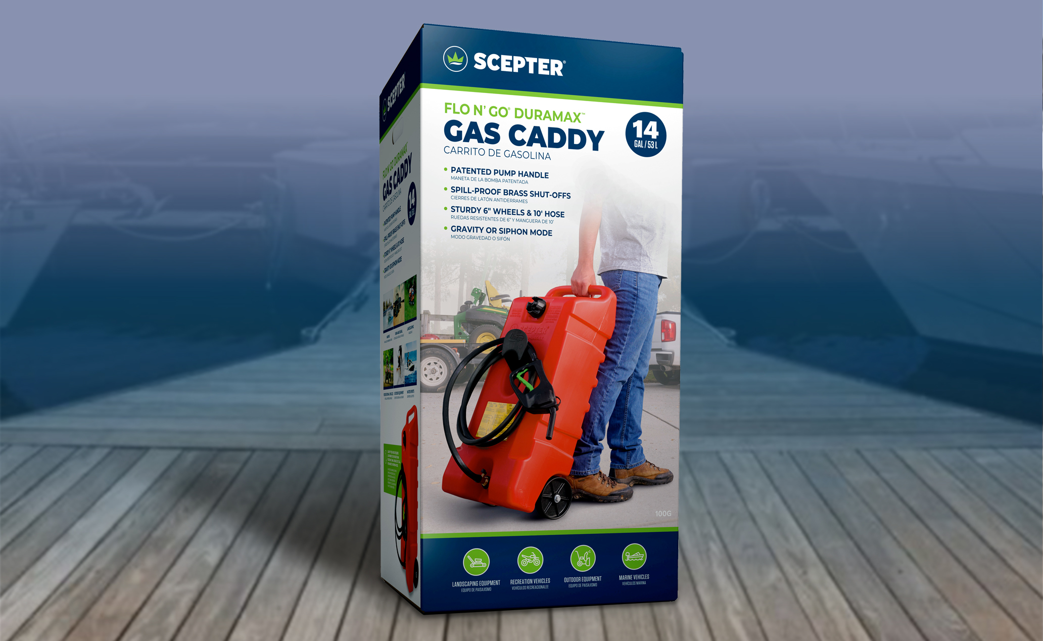
Strengthened product descriptor to be simple and communicate more clearly
LW emphasized larger product photo, highlighting product features of fuel pump handle, wheels and showed the product’s mobility
Background supporting imagery focused on landscaping equipment to better resonate with Lowe’s and Home Depot customers

